
Design & Themes: Layouts, Colour Styles, Fonts & Backgrounds
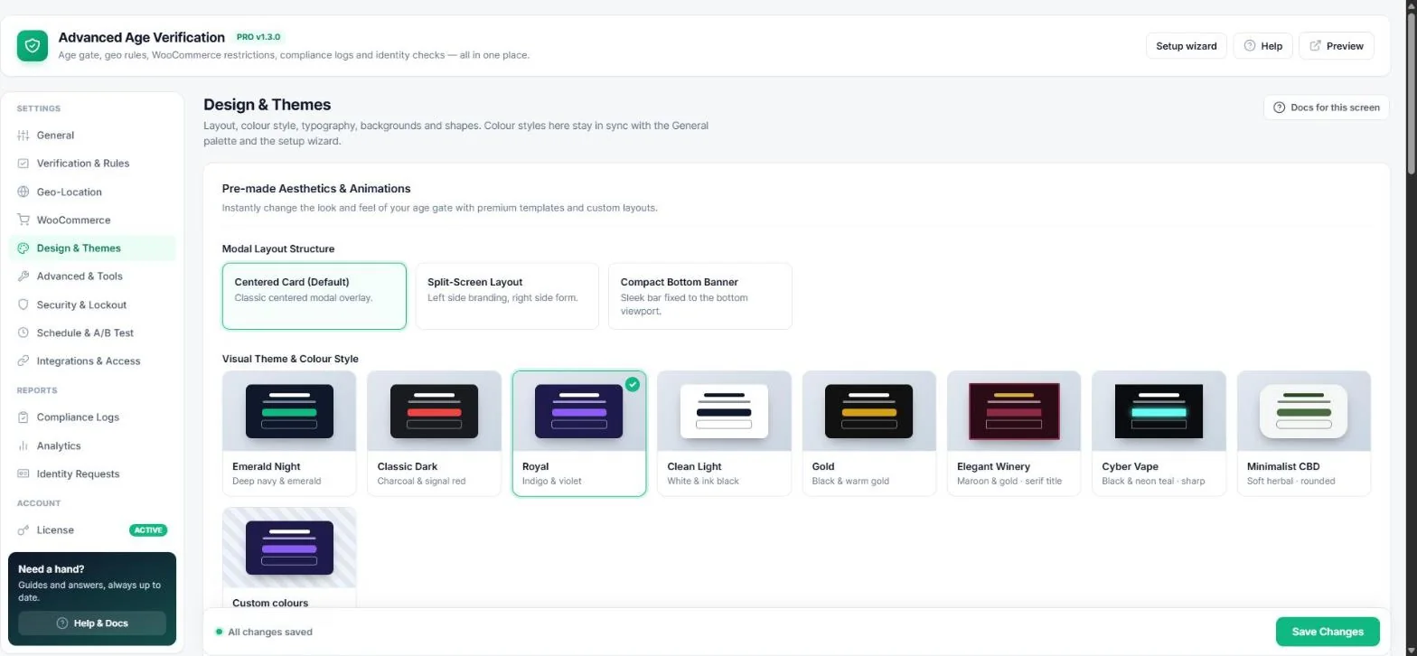
Make the age gate look like part of your brand. Open Age Verification → Design & Themes; every change shows in the live preview.
Layout
- Centered card — the classic modal (default).
- Split screen — branding on the left, form on the right.
- Compact bottom banner — a slim bar at the bottom of the screen; great with soft gating.
Colour style
Pick one of eight ready-made styles — Emerald Night, Classic Dark, Royal, Clean Light, Gold, Elegant Winery, Cyber Vape, Minimalist CBD — or Custom colours. The style is linked to General → Colour palette and the setup wizard: change it in one place and the others follow.
Typography, animation and shapes
- Entrance animation — zoom, slide up, bounce or soft crossfade.
- Google Fonts — Inter, Playfair Display, Oswald, Montserrat, Poppins or your theme's font.
- Corner radius — separate sliders for the popup and for buttons / fields, so the gate matches your theme's buttons.
Backgrounds and glass effect
- Background image or a silent, looping MP4 video behind the popup.
- Blur intensity — how blurred the site behind the popup is (0 = none).
- Popup translucency — lower it for a frosted-glass look.
Close button & soft exit
Turn on Close button to let visitors close the popup without failing the check (an “X” icon or a text link such as “I'll verify later”). Recommended with soft gating.
Custom CSS & JavaScript
Add your own CSS (loaded in the page head) or JavaScript (runs after the gate loads) without editing theme files.
Tip: Want to test two designs? Run an A/B test and let your visitors decide.
Read next
Was this guide helpful?